
Chart of the Day: Florida Top 7 out of 20
Today’s Chart of the Day was shared by my colleague Christine Davis, Director of Commercial Banking Services at Crews Bank & Trust.
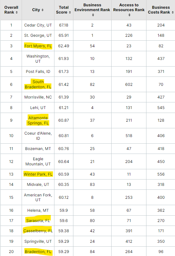
Today’s Chart of the Day was shared by my colleague Christine Davis, Director of Commercial Banking Services at Crews Bank & Trust.
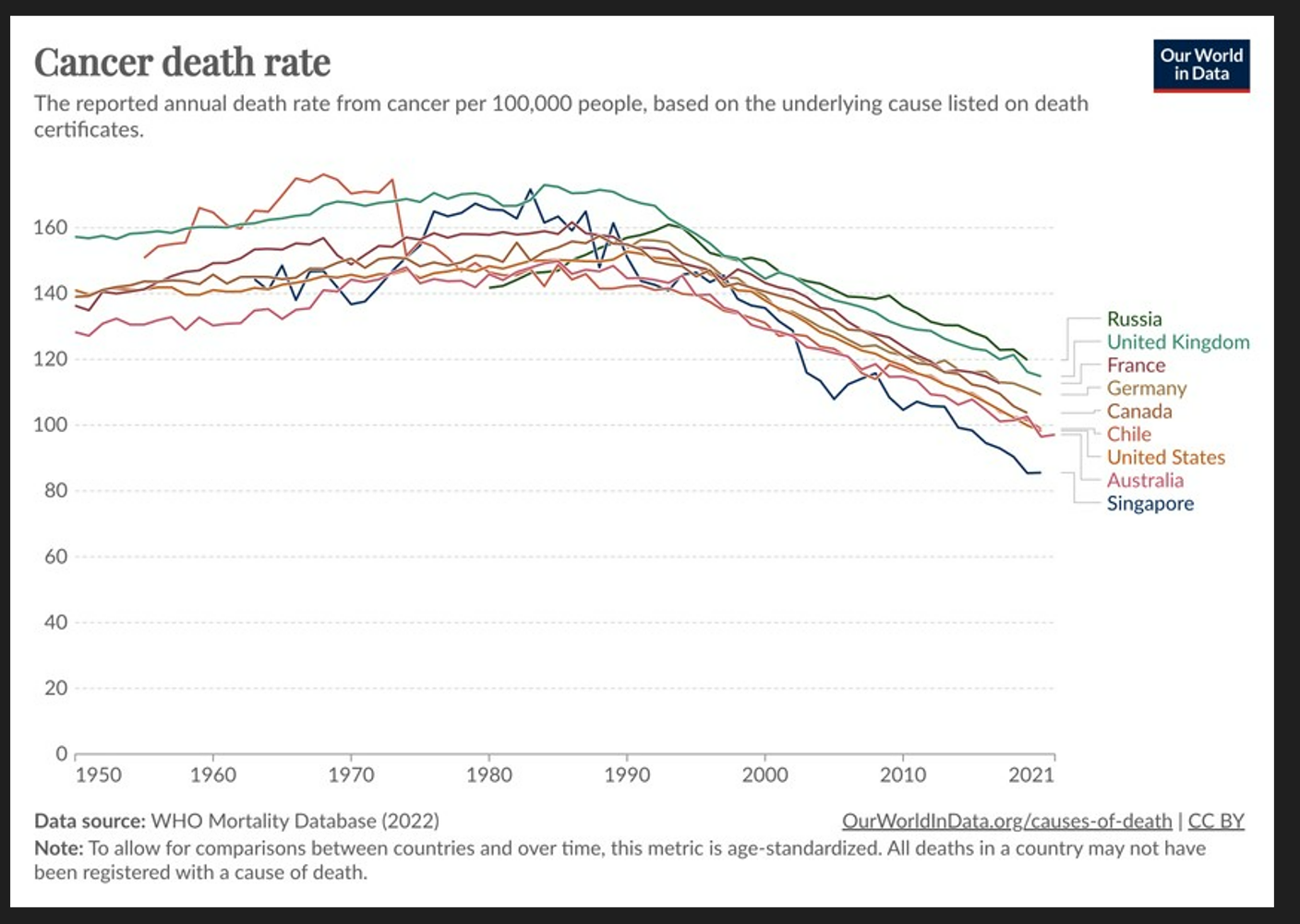
Today’s Chart of the Day from Our World in Data shows the death rate from cancer per 100,000 people going back to 1950.
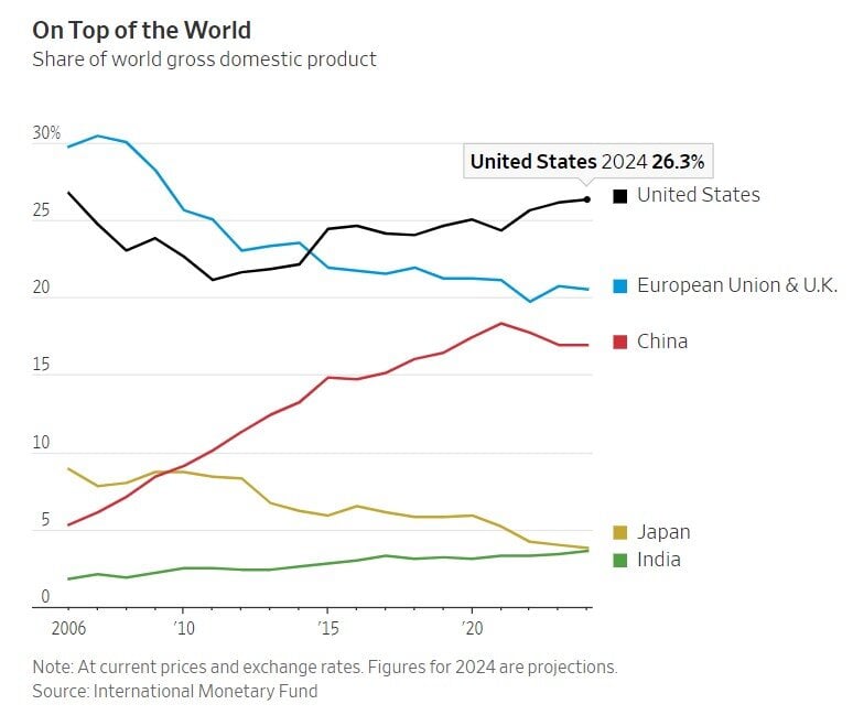
Today’s Chart of the Day is from the Wall Street Journal and shows the percentage of the World’s Gross Domestic Product (GDP) provided by the largest..
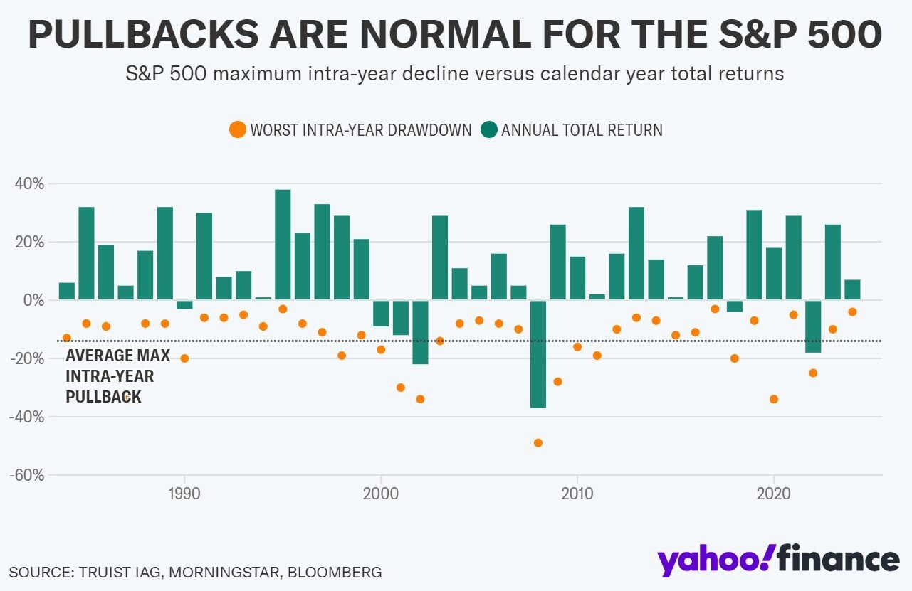
Today’s Chart of the Day from Yahoo Finance shows the annual returns of the stock market by year for the last 40 years, which resulted in an average..
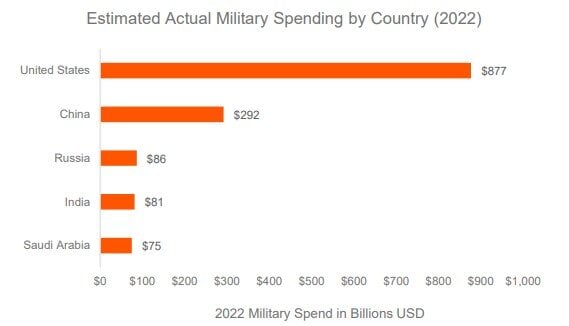
Today’s Chart of the Day from Global X, with data provided by Stockholm International Peace Research, shows that the United States spends almost 2x..
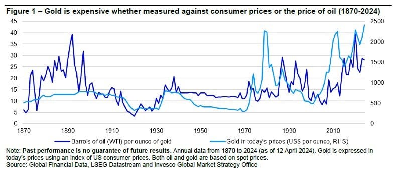
Today’s Chart of the Day is for my gold bugs. It is provided by Invesco and shows one way that investors use to value gold is to compare it to the..
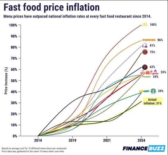
Today’s Chart of the Day is from Charlie Bilello with data from FinanceBuzz. It shows the inflation of fast-food prices over the last of 10 years vs...
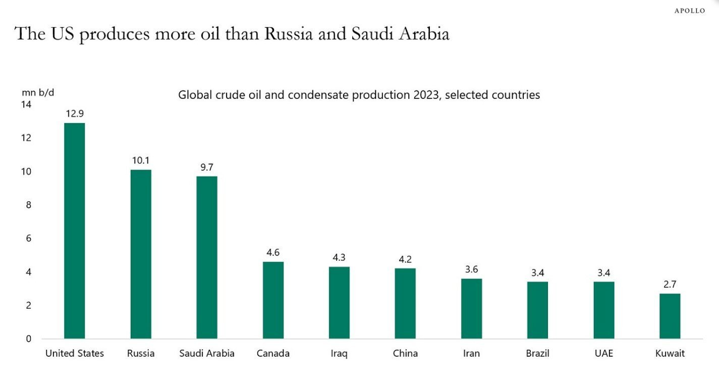
Today’s Chart of the Day is from Dr. Torsten Slok of Apolo Global Management with data from the International Energy Statistics.
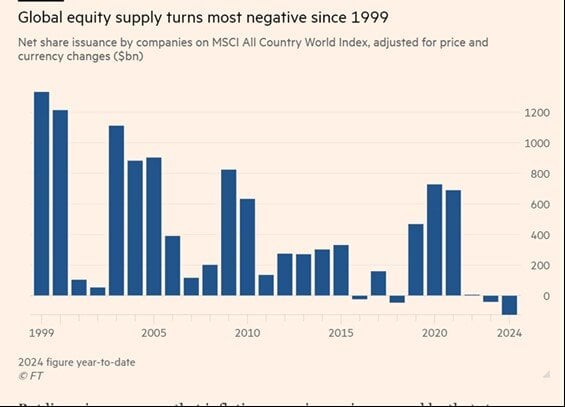
Today’s Chart of the Day is from the Financial Times with a note from Callum Thomas. The chart shows that there is a shrinking level of publicly held..
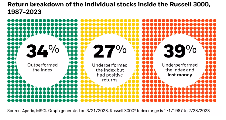
Today’s Chart of the Day from Aperio shows the percentage of individual stocks in the Russell 3000, which represents the 3,000 largest stocks in the..
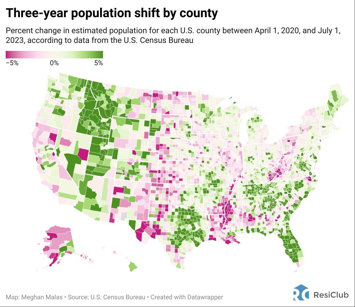
Today’s Chart of the Day is from Meghan Malas with data from the US Census Bureau.
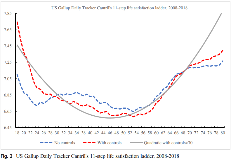
Today’s Chart of the Day is from an article discussed in "A Wealth of Common Sense" by Ben Carlson with data from a research paper by David..
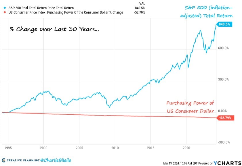
Today’s Chart of the Day comes from Charlie Bilello with information from YCharts. Over the last 30 years, inflation reduced the value of a dollar by..
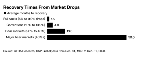
Today’s Chart of the Day from CFRA Research goes all the way back to 1945 and shows the average number of months it takes to “recover” from market..
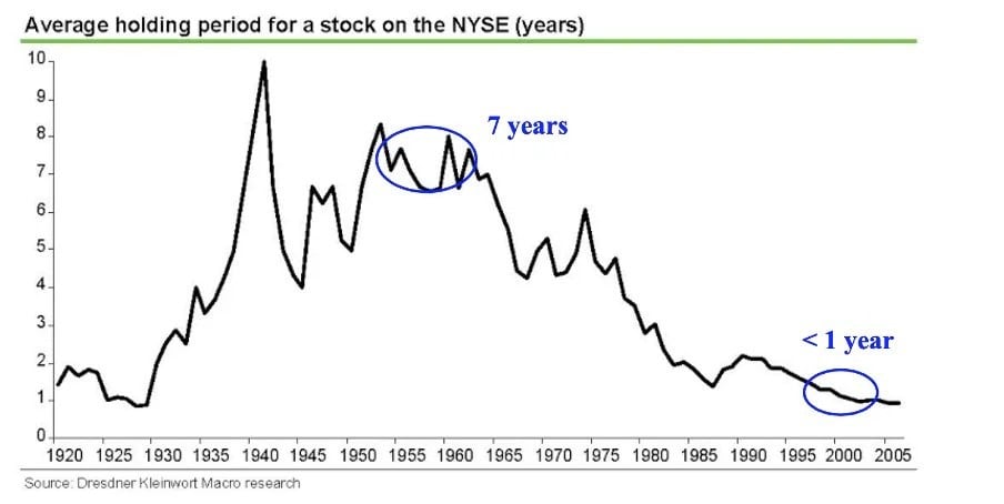
Today’s Chart of the Day is from Dresdner Kleinwort Macro Research and notes the average holding period of stocks since 1920.