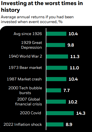
Today’s Chart of the Day is from Mark Peterson with BlackRock. The chart, going back to 1926, shows the returns if you had been invested on the day when each of the eight worst major events occurred, and then experienced the subsequent stock markets.
The average return since 1926 is 10.4%. Keeping that in mind, the worst was the 2000 tech bubble burst which still resulted in a 7.7% return, and the highest was the 2020 COVID pandemic which had a return of 14.3%.
Even if one experienced one (or several) of the eight worst events in history, the ranges of returns are not that different than you would expect during less chaotic times. My advice is to ignore the noise, buy good investments, hold steady and repeat.
More