
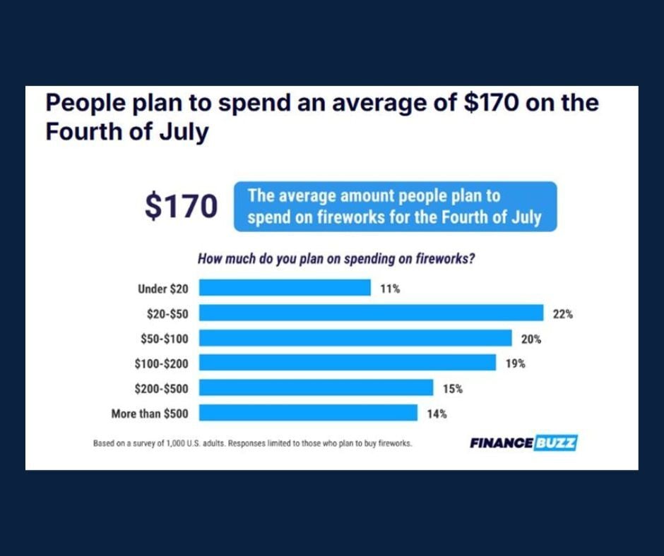

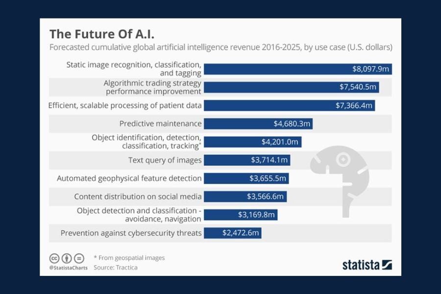
Chart of the Day: Fourth of July Spending
With the 4th of July approaching, and as we prepare to celebrate America’s 250th anniversary, today's Chart of the Day from a FinanceBuzz blog, Fourth of July [2026]: How Much Will People Spend?, shows the expected spending surrounding firework purchases this year.