
Chart of the Day: Top 15 Individuals
Today’s Chart of the Day is from Bloomberg’s Billionaires Index, listing the 15 wealthiest individuals on the planet.
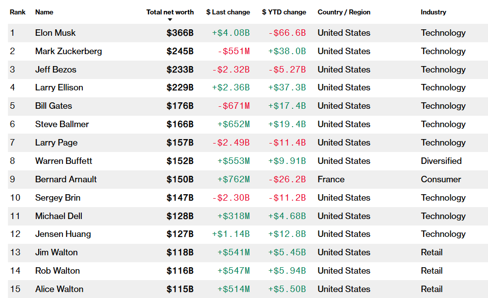
Today’s Chart of the Day is from Bloomberg’s Billionaires Index, listing the 15 wealthiest individuals on the planet.
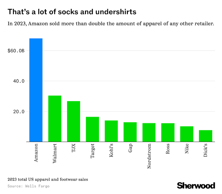
Today’s Chart of the Day, from Wells Fargo in an article by Sherwood, is something to ponder the next time you’re at the mall - if you still go.
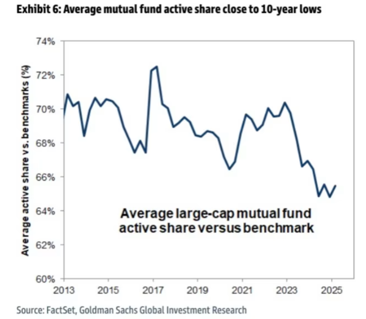
Today’s Chart of the Day is from Goldman Sachs and was featured in an article in the Financial Times. It illustrates the trend in “Active Share Vs...
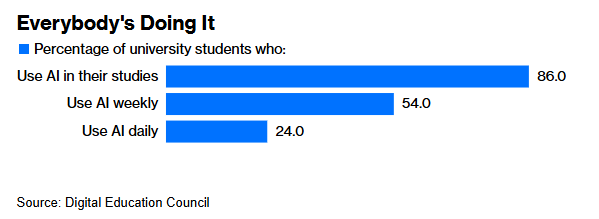
Today’s Chart of the Day is from the Digital Education Council and presented by Bloomberg in an article called “ Does College Still Have a Purpose in..
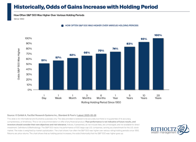
Today’s Chart of the Day is from Ritholtz Wealth Management and shows the odds of having a gain while holding stocks represented by the S&P 500.
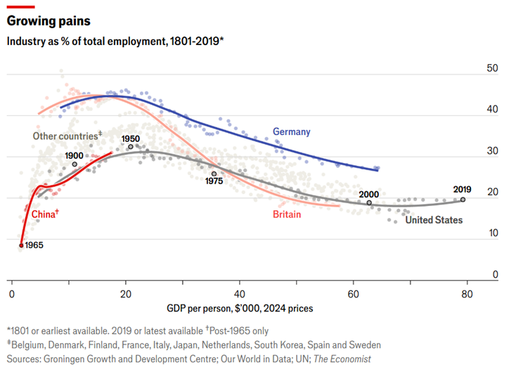
Today’s Chart of the Day was provided by my colleague and fellow Portfolio Manager Angie Parsons from an article in the Economist.
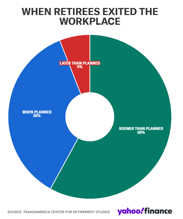
Today’s Chart of the Day is from Yahoo Finance showing when retirees exited the workforce.
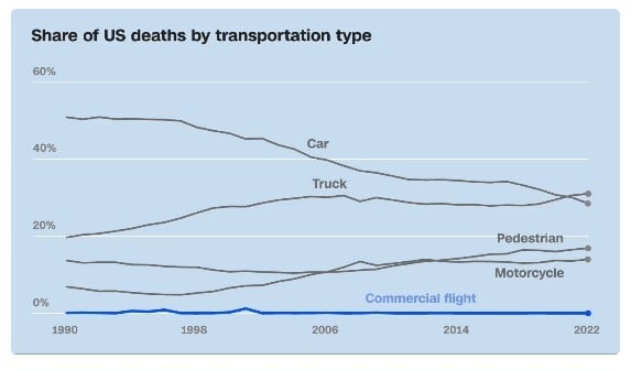
Today’s Chart of the Day is from CNN and shows the percentage of US deaths by transportation type.

Today’s Chart of the Day is from Statista and shows America’s favorite clothing brands.
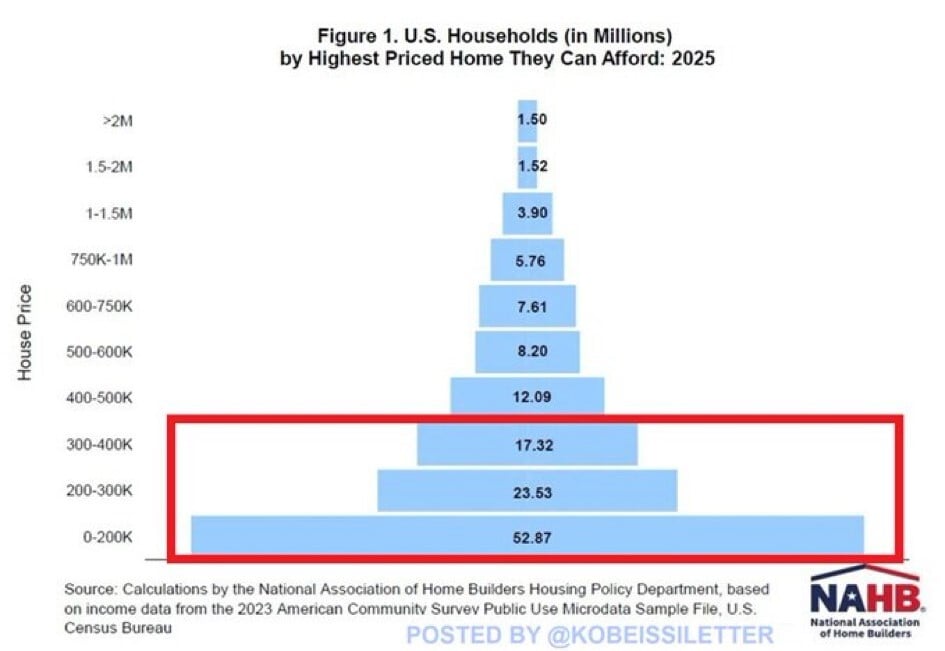
Today’s Chart of the Day is from @kobeissiletter with data from the National Association of Home Builders (NAHB) showing the number of US households..
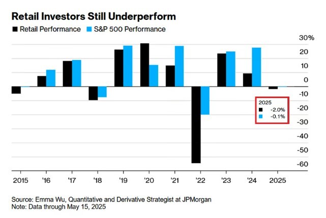
Today’s Chart of the Day from JP Morgan shows that as of May 15, 2025, the average retail investor is underperforming the market by 2%.
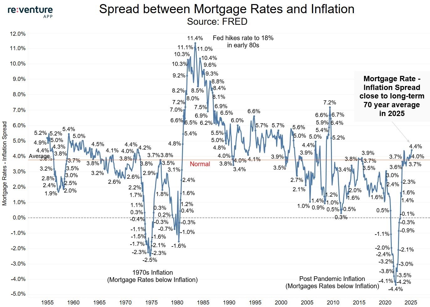
Today’s Chart of the Day from re:venture shows the difference between mortgage rates and inflation going back to 1955.
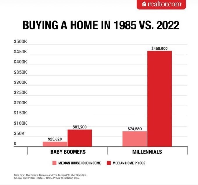
Today’s Chart of the Day comes from Realtor.com and shows the difference between the average price of homes vs. incomes. It took 3.5 years of income..
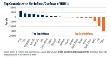
Today’s Chart of the Day from First Trust shows the top inflows and outflows of high-net-worth individuals (HNWI) who have $1,000,000 or more in..
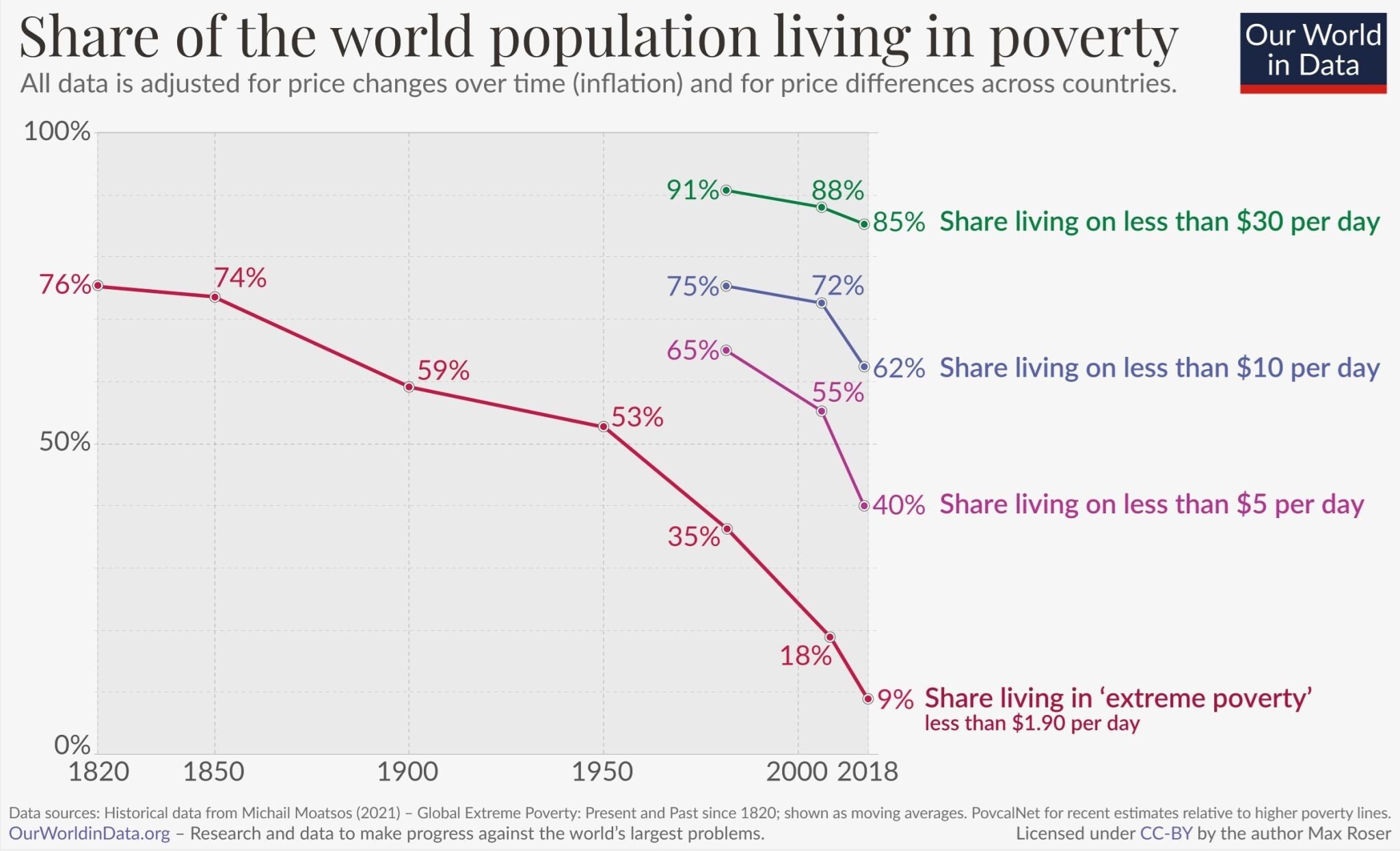
Today’s Chart of the Day from OurWorldData.org was shared by @petermallouk on X showing the share of the world living in poverty.