
Chart of the Day: Ice Cream vs. Shark Attacks
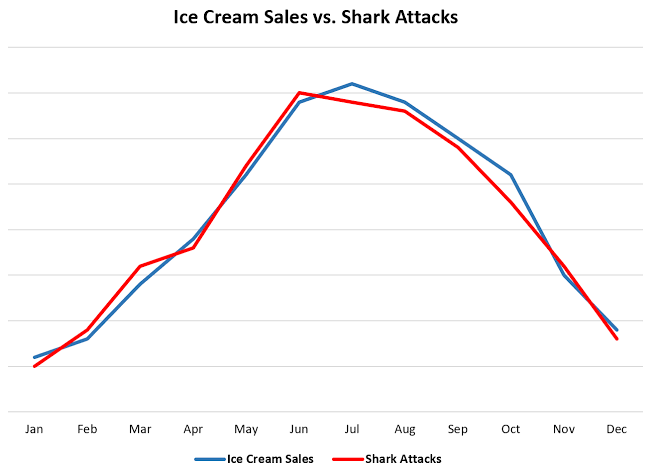
Today’s Chart of the Day is a little different than what I usually share. The chart compares ice cream sales and shark attacks over the course of a year, both which peak during the summer.
Today’s Chart of the Day is a little different than what I usually share. The chart compares ice cream sales and shark attacks over the course of a..
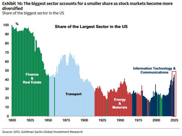
Today’s Chart of the Day from Goldman Sachs takes a look at how the biggest sector in the U.S. stock market has changed over time, from 1800 to..
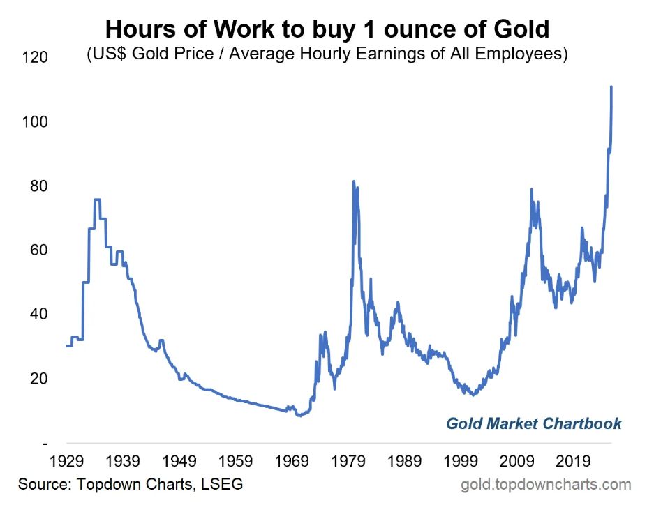
Today’s Chart of the Day comes from the Gold Market Chartbook and shows how many hours of work it takes to buy one ounce of gold.
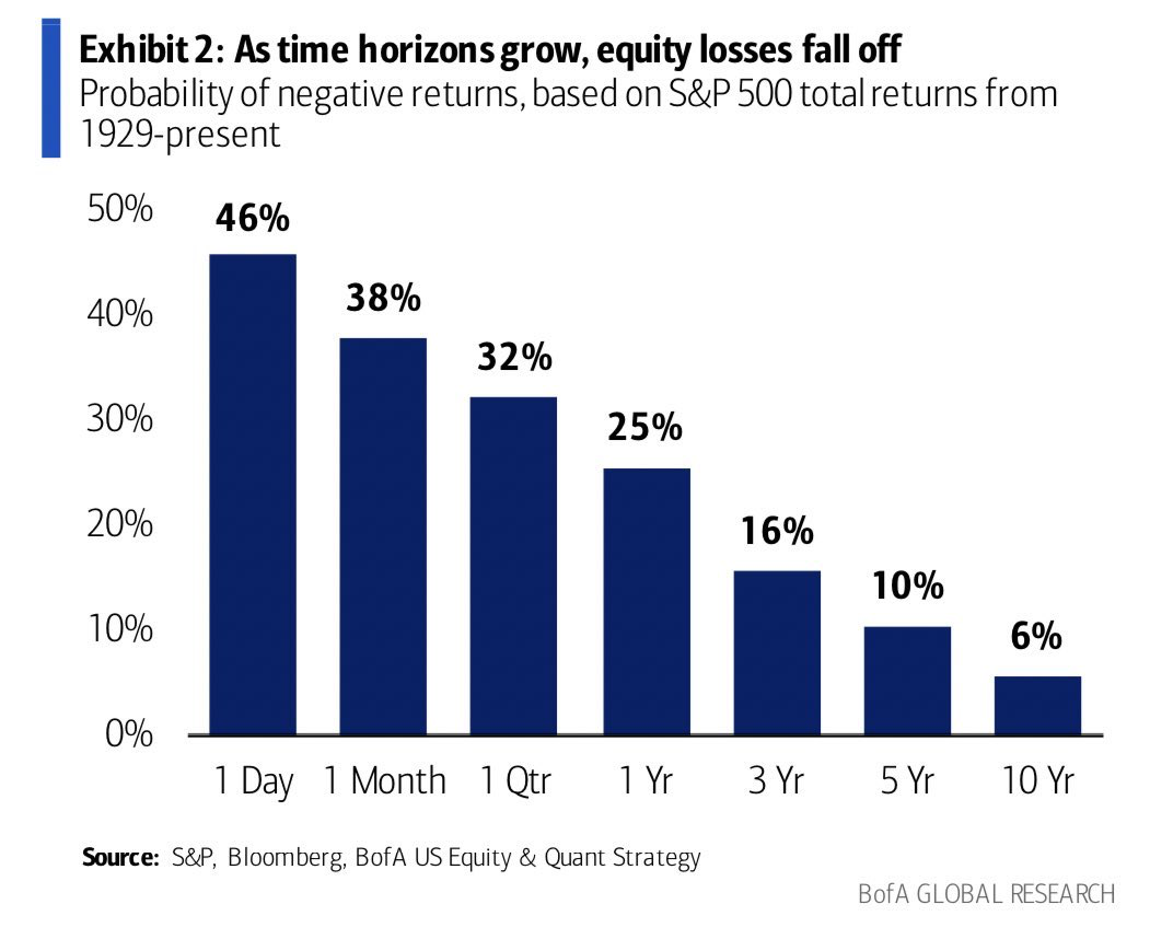
Today’s Chart of the Day is from Brian Feroldi from Bank of America Global Research, showing a chart from 1929 that shows as time horizons grow, the..

Today’s Chart of the Day is from Barrons with data from Ameriprise showing the percentage of Americans who fund or are preparing to fund certain..
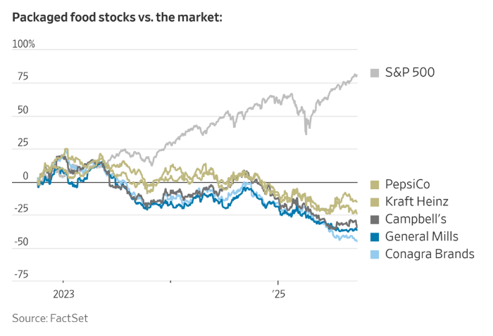
Today’s Chart of the Day from FactSet was included in an article titled, “Startups Are Eating Big Food’s Lunch”, featured in the Wall Street Journal.

With a nod to all the sporting events that take place in the fall, sharing today’s Chart of the Day from Topley’s Top 10, with data from the Pew..
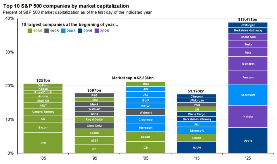
Today’s Chart of the Day is from Mike Zaccardi @MikeZaccardi and shows the ten largest companies in the S&P in 10-year spans for the last 40 years..

Today’s Chart of the Day is from the National Association of Home Builders showing the life expectancy of parts and systems in your home.
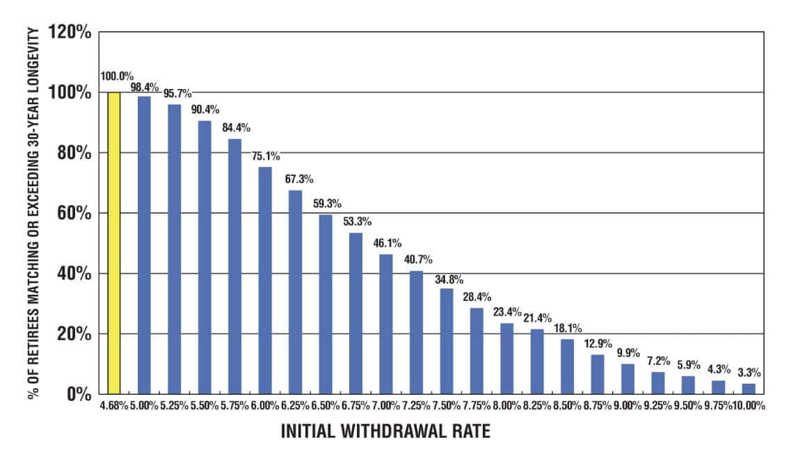
Today’s Chart of the Day is from an article called “ Why the 5% Rule is the New 4%” by Nick Maggiulli and includes a chart from Bill Benger’s new..
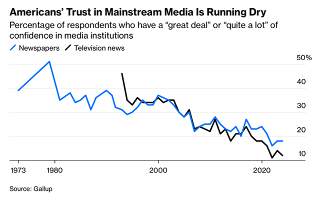
Today’s Chart of the Day is from Gallup and shows Americans' trust, or lack of, in mainstream media over the past 50 years.

Today’s Chart of the Day is from the BLS (Bureau of Labor Statistics) and shows projected job openings from 2024-2034 for those with a bachelor’s..

Today’s Chart of the Day is from Accounting Knowledge Concepts’ X page and shows six financial rules that everyone should know by age 30.
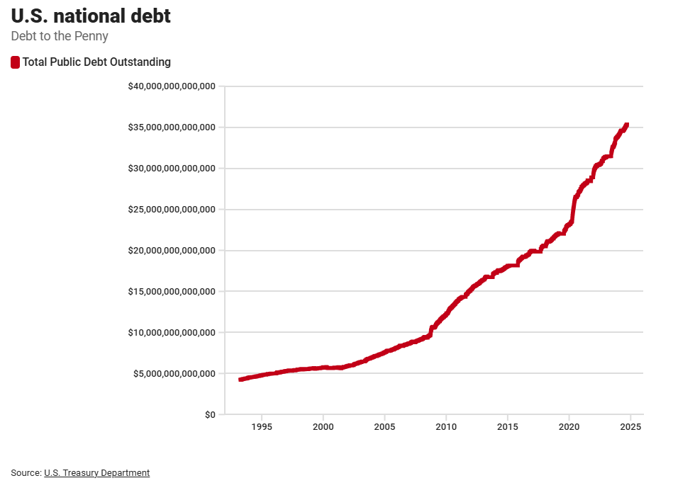
Today’s Chart of the Day is from the US Treasury and shows the growth of the US National Debt from $5 trillion in 1995 to $35 trillion in 2025.
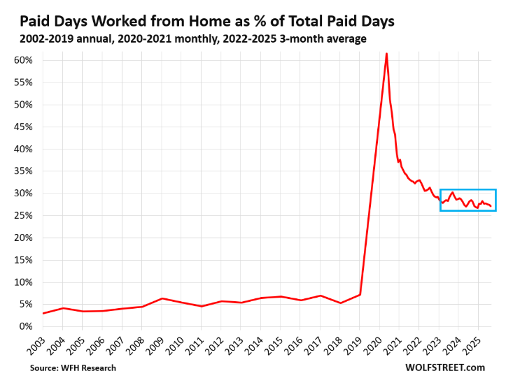
Today’s Chart of the Day is from Wolfstreet.com with data provided by WRH Research showing that the RTO (Return to the Office) trend has stalled..