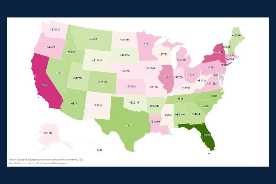
Chart of the Day: More Investments = Less Risk (To a Point)
Today’s Chart of the Day spotlights an important investment concept which was pioneered by Harry Markowitz, a Nobel Prize winner and pioneer of the Modern Portfolio Theory in 1952.
Learn about our Refer-a-Friend Program. Terms and conditions apply.
Hurricane season is unpredictable. Your finances shouldn’t be. A Home Equity Line of Credit (HELOC) gives you access to funds when you need them most.
Today’s Chart of the Day spotlights an important investment concept which was pioneered by Harry Markowitz, a Nobel Prize winner and pioneer of the..
Today’s Chart of the Day from Wolfstreet shows that Work from Home, a.k.a. WFH, is getting “sticky” at 30% after peaking at 60% during the pandemic.
Today’s Chart of the Day uses data from the National Association of Realtors compiled by Torsten Sølk with Apollo, showing the history of the median..
Today’s two charts illustrate that Florida continues to struggle with increasingly more expensive homeowners' insurance.
Today's Chart of the Day, from BlackRock, illustrates the potential downside of staying in cash for too long. It highlights the excess returns of a..
Today’s Chart of the Day from Chartr shows that over 75% of American’s are using Amazon Prime as of 2024. Amazon is now the 4th largest company in..
Today’s Chart of the Day has data from the Journal of Personality and Social Psychology used by our partners at BlackRock (the company that owns..
Today’s Chart of the Day from Bloomberg shows the percentage of assets and revenue by ETFs (Exchange Traded Funds), which we use extensively in..
Today’s Chart of the Day, shared by my colleague Angie Parsons, is from an article in Bloomberg which illustrates what a “value” stock is.
As we near the Super Bowl, today’s Chart of the Day is from Chartr and shows the boom in online monthly sports betting.
Today’s Chart of the Day from Vanguard shows the distribution of returns from 1928 to 2024, for stocks, bonds, and a combined 60% stock/40% bond..
Today’s Chart of the Day is a little different than others, but one to think about. It’s from the book Atomic Habits by James Clear written in 2018.
Today’s Chart of the Day, from OfDollarsndData, shows the Shiller inflation-adjusted value for US housing since 1890 and is the longest historical..
Today’s Chart of the Day comes from Bank of America and shows the price of diamonds going back 22 years. After spiking in 2022, diamond prices are..
Today’s Chart of the Day is from Visual Capitalist, looking at the $115 trillion world economy in 2025, broken down by county.
Today’s Chart of the Day spotlights an important investment concept which was pioneered by Harry Markowitz, a Nobel Prize winner and pioneer of the Modern Portfolio Theory in 1952.
Today's Chart of the Day, from BlackRock, illustrates the potential downside of staying in cash for too long. It highlights the excess returns of a 60% stock/40% bond portfolio compared to cash since 1926. The top bars (red) show these returns; for instance, a 10-year holding period yields returns 100% higher than cash.
The black boxes below show the percentage of time cash underperforms; for 10 years, that is 91% of the time.
This highlights the old adage, "It’s not about timing the market, but time in the market." If you have funds that you will not need for more than 10+ years, historically, stocks have been your best bet.
Today’s Chart of the Day from Chartr shows that over 75% of American’s are using Amazon Prime as of 2024. Amazon is now the 4th largest company in the United States and has an annual return of 27% a year vs. 15% for the S&P 500 over the same time frame.
Today’s Chart of the Day has data from the Journal of Personality and Social Psychology used by our partners at BlackRock (the company that owns iShares) for a presentation they recently provided to our clients.
Today’s Chart of the Day from Bloomberg shows the percentage of assets and revenue by ETFs (Exchange Traded Funds), which we use extensively in portfolios.
Today’s Chart of the Day, shared by my colleague Angie Parsons, is from an article in Bloomberg which illustrates what a “value” stock is.
As we near the Super Bowl, today’s Chart of the Day is from Chartr and shows the boom in online monthly sports betting.
Today’s Chart of the Day from Vanguard shows the distribution of returns from 1928 to 2024, for stocks, bonds, and a combined 60% stock/40% bond portfolio. It also shows where we have ended up in the last four years.
Today’s Chart of the Day is a little different than others, but one to think about. It’s from the book Atomic Habits by James Clear written in 2018.
current_page_num+2: 4 -